|
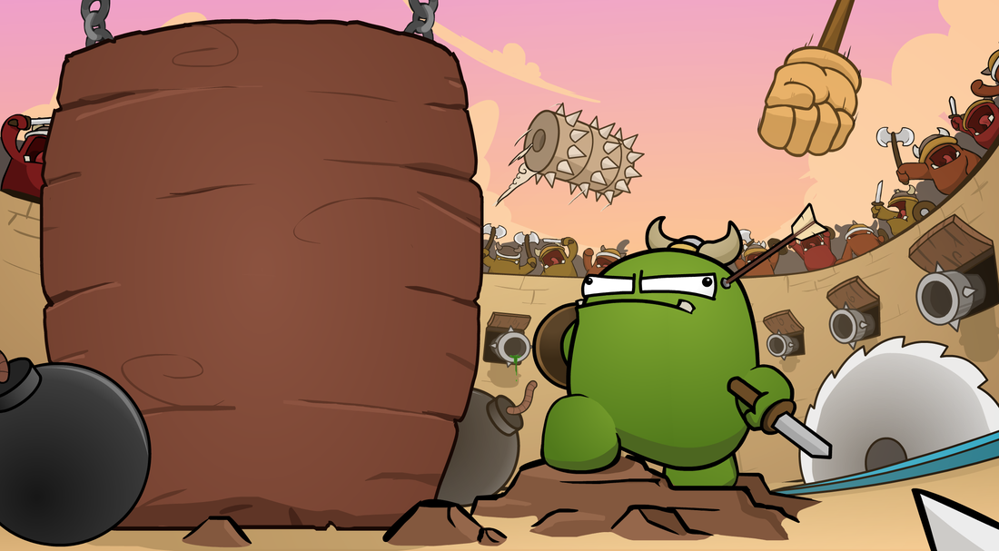
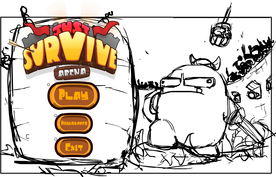
Welcome back to another Juicy Development Blog! I'm going to keep it relatively short this week since all I have been working on is the background for the main menu screen, which, took a lot longer than I thought. I really liked the concept idea I had last week, so I decided to refine it even further. During the development process, I asked for a number of opinions about the layout, composition, and balance of the game menu, and I have to say, I received A LOT of good feedback. The feedback was less directed at the image itself, but more in terms of the UI design. I had a lot of comments about the buttons being hard to read, and that the 'high score' word was very difficult to understand. The placement of the buttons could be adjusted as well, such as a horizontal row, rather than a vertical one. I also had an interesting suggestion to remove the text completely and rely more on icons. This, I think, is a really good idea since icons are a lot more universal than any particular language. Rather than accommodating multiple languages which all read 'start/play/begin', I could use a universal icon such as 'play' (that funny little triangle). I did get one comment about the readability of the overall composition. Someone suggested to essentially 'reverse' the image since people read from left to right, and since the buttons are the most important, then it would make sense to have them the last thing the player sees. I also found this comment interesting, so I tried a few ways to make this work (reversing the image, changing the characters pose, changing the concept, etc.), but no matter what I did, it still felt disconnected. I wanted the UI to feel as if it was a part of the overall scene, so having the character looking at the main 'bill board' made it feel as though the character was ready for battle, and didn't care about what options the player chose. Don't get me wrong, the suggestion was good, but for what I'm aiming for didn't really suit that particular composition idea. Below is the initial concept, and the final design (minus the UI and background, which I'm thinking of revisiting soon). If you have any suggestions yourself, I would love to hear them! This week was less about quantity and more about quality, so apologies for the lack of content. Hopefully next week I'll have the UI done, the medal changes as I mentioned last week, and some video footage. Oh! I'm also keen to show you an idea I have for the credit screen... Well, when I get around to it that is. So stay tuned for that as well! Until next week, Thanks for reading!
0 Comments
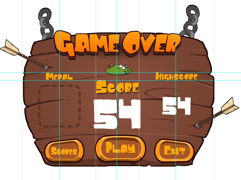
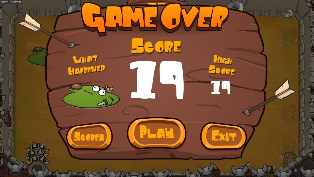
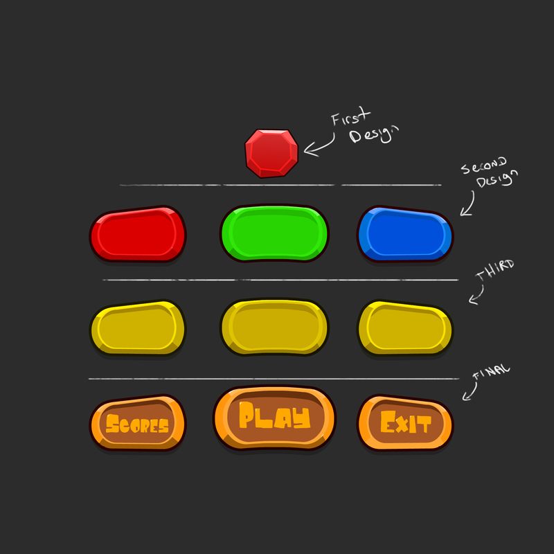
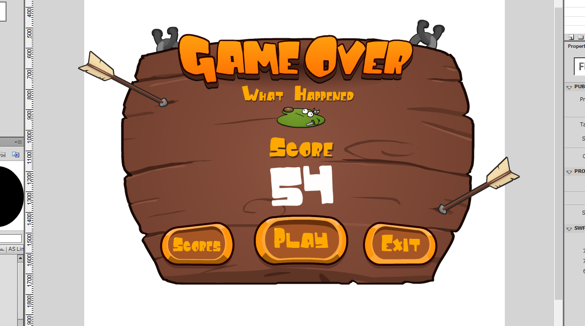
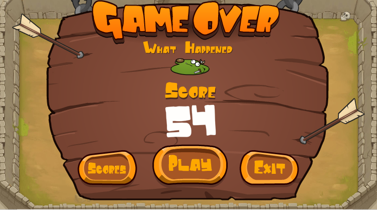
Welcome back to another jam-packed week of Juicy Development! This week I have been hard at work implementing the medal system as well as mocking up a few Main menu concepts. The medal system took a little longer than expected since I couldn't decide what design idea I liked. As you can see below, there were a few iterations of the medal designs before staying with a design i liked. The second design is the final design. Once I finalized the design in Flash, I then moved on to implement each one. While implementing these, I soon realized that I would need to make more room on my 'Game Over' banner, so rather than trying to squish it all in, I reorganized the banner yet again (third times the charm). I ended up removing the 'what happened' text and just kept the character centered to the banner, above the 'Score' text. I also increased the size of the 'High-Score' score text to better balance the banner. Lastly I added a display showing where the medals would be inserted if the player were to receive one. Overall, this design feels even more balanced and organised then the previous one. Once I had implemented these changes, I gave the game a test run. While playing, I noticed that the medals lacked something. At the time, it didn't really feel that I had achieved anything and felt like another mechanic without a reward. After a while, I realized what was missing... Some Juiciness! I needed more effects and aesthetics to really give my medals more impact, so I added a shine behind the medal, and some fancy sparkles, and for the harder rewards, I added a camera shake. While playing the game, I felt a lot more involved and overall good about achieving these rewards. I still need to add a few tweaks here and there for the effects, but overall, I'm happy with the result. Below is what each medal reward looks like in game. Let me know what you think! There are six medal to collect; Wooden Spoon, Bronze, Silver, Gold, Platinum, and Onyx The scores you see aren't the final for these rewards. They are just for testing purposes. Also, i realized that the video still has smaller text for the high score rather than the implied size above... Which I will also fix... I'll just add that to the list of things to do. Any way, after implementing these, I then started thinking about what the main menu should look like. Initially I wanted the player to stand on these rocks with fire all around him, but after fleshing out the idea, I realized that it didn't really fit well with the game design. It felt a little disconnected and misleading... So back to the drawing board I went. I enjoyed the initial character idea with him standing on this rock/rubble mound, and wanted to see how I could incorporate that into a more suitable design. I sketched up a few more ideas and ended up with this... He's basically standing in the middle of the arena with -for a lack of a better term- "shit" going crazy around him. The title and buttons are merely placeholders for now, but I will be refining these next week. I had managed to animate the character and implement him into the game (not yet hooked up). This is his current animation in Spine2D. Let me know what you think! Besides that, I think that is basically it! So next week I plan to not only tweak a few aesthetics with the medal system, but also plow ahead with the main menu screen. Hopefully I will have all this up and running by then, but we shall see! Until next week, Thanks for reading! Hey everyone, and welcome to yet another exciting Juicy Dev week! Yes, I am a little late this week, but for good reason. I figured that since I'm releasing these blog updates so close to Saturday, why not incorporate them into a Saturday post? That would save duplicate images being splattered all over the #ScreenshotSaturday pages. So, from now on I'll probably start doing these blogs on Saturday rather than the Friday night. Now then, on to the dev talk! This week I have managed to implement the 'Game Over' elements as well as 're-implementing' the power-up system (basically just plugging them back into my code). I'm super excited to show you some game-play footage of the 'Game Over' screen. I can't tell you how good it is to be able to finally replay the game straight away. Before, I had to exit out of the game completely and then start it back up again... it was very painful. As you may have noticed, the UI elements have been adjusted slightly so that now I'm utilizing more of the 'Game Over' banner's real estate rather than just the middle of it. This change feels a lot less cluttered and a lot more comfortable. Again, let me know what you think! Originally, I had been tossing up between separate animated elements (i.e. the 'Game Over' text, the 'Score' text and the 'What Happened' text to spring into existence one at a time), and having everything on the one static image. I ended up keeping these elements within the one image, since having them all animated made it feel busy and too slow for the 'in and out' game-play. Next week I'm hoping to implement the Medal designs, as well as fix a few small bugs here and there (aesthetic as well as programmatic). I'm also hoping to begin work on the actual main menu page, which I cannot wait for! I have a design in mind which I hope you all will enjoy. But besides that I think that's it for this week. I can see it's getting to the point of an actual finished game. It's definitely coming close to a close... Close to a close... wow, that's a weird sentence. Anyway, Until next week! Thanks for reading! Hey everyone, and welcome back to another Juicy Developer Blog. This week I've had much to do in terms of the completion of the game. I'm finally up to the stages of finalizing the game-play. I've started brainstorming some ideas for how I want the game over screen to look. Essentially I want a drop down banner to appear (similar to Slidey Feet) which will show how you died, what your score is, high score, the medal you will receive, and the 'play/exit/leader-boards' buttons. I've been playing around with the style and colors as well to try and find a color palette I'm happy with. Below is what I had recently worked on and the bottom button design being the final result... It was hard to come up with a style to one that fit the the game. I ended up browsing a number of UI websites and found a few styles I didn't really mind. The first 'gem' button style (top button) I liked initially, but the more I looked at it, the more I dislike it. It didn't really fit the 'comical orc arena' theme too much. If the game was similar to clash of clans, with like kings and royals, then maybe. But I needed to think more.. 'primitive' and less 'jewelry-ish' so I scrapped the gem button idea and moved on to something more simple. I then thought about using simple rounded rectangle shapes. Again, something didn't feel right. It still felt that it was missing the 'humor' factor. So I decided to add a bit of shape to the primitive button design, and I started to see something... something that worked! I ended up with a design which was quite quirky, yet fit within the style of the game. Once the initial shape of the button was down, I then needed to think about the colors -which, on the record, I suck at-. I initial thought maybe having distinct color might help distinguish each button, but it felt too colorful. I then tried a monochromatic color palette, which then felt too bland. After a while of tearing my hair out, I stumble upon a few more designs online which I really liked, and noticed that the buttons they used where split up into two parts; the frames, and the center of the button. I started to experiment a little more with these designs. I tried a wooden backdrop with a golden frame, but the wood felt that it was apart of the banner more than a button, which I didn't really like, so I tried something else. I finally ended up with a design which I'm happy with (golden trim, with a tan color backing). The text basically came to me very quickly afterwards and I ended up with what I have now (bottom). Here is the final result of what I have done so far... And here is what it 'would' look like in the game. I still need to implement these elements into the game engine. Now, I still need to add the medal you would receive, and your personal high score to this as well, but basically everything is there. I may need to re-arrange a few elements within the banner a bit for them to all fit together, but I'm pretty much done. Now, again I don't have any game play this week since I haven't really touched it. I know I still need to add the power-ups and tweak the difficulty of the traps, but I don't think I would be really touching the game play much from this point onward, well, not until Beta testing. Next week I hope to actually have all this in game and show you some footage. I also hope to add in the power ups and tweak the difficulty of the traps. That about sums it up for this week. Until next week! Thanks for reading! |
AuthorLindsay is a solo game developer, designing and creating games that he hopes all will enjoy. Archives
February 2020
Categories |
JuicyBeetleGames® 2016. Terms and Conditions apply for all products and Services. Please read them carefully to understand what we cover. To view the Terms and conditions, click here. To view our Privacy Policy and what information we use, please click here.


 RSS Feed