|
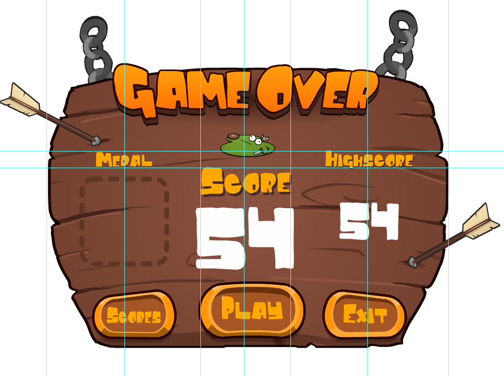
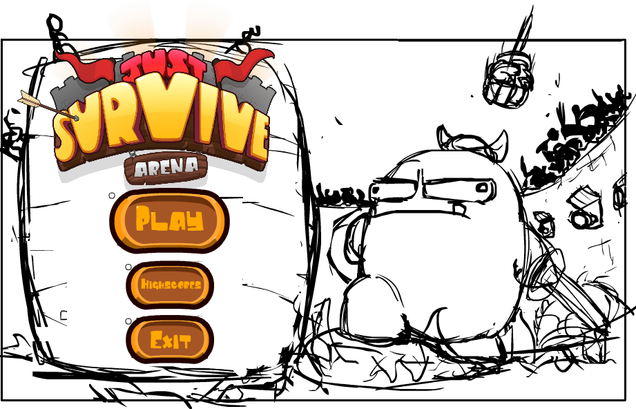
Welcome back to another jam-packed week of Juicy Development! This week I have been hard at work implementing the medal system as well as mocking up a few Main menu concepts. The medal system took a little longer than expected since I couldn't decide what design idea I liked. As you can see below, there were a few iterations of the medal designs before staying with a design i liked. The second design is the final design. Once I finalized the design in Flash, I then moved on to implement each one. While implementing these, I soon realized that I would need to make more room on my 'Game Over' banner, so rather than trying to squish it all in, I reorganized the banner yet again (third times the charm). I ended up removing the 'what happened' text and just kept the character centered to the banner, above the 'Score' text. I also increased the size of the 'High-Score' score text to better balance the banner. Lastly I added a display showing where the medals would be inserted if the player were to receive one. Overall, this design feels even more balanced and organised then the previous one. Once I had implemented these changes, I gave the game a test run. While playing, I noticed that the medals lacked something. At the time, it didn't really feel that I had achieved anything and felt like another mechanic without a reward. After a while, I realized what was missing... Some Juiciness! I needed more effects and aesthetics to really give my medals more impact, so I added a shine behind the medal, and some fancy sparkles, and for the harder rewards, I added a camera shake. While playing the game, I felt a lot more involved and overall good about achieving these rewards. I still need to add a few tweaks here and there for the effects, but overall, I'm happy with the result. Below is what each medal reward looks like in game. Let me know what you think! There are six medal to collect; Wooden Spoon, Bronze, Silver, Gold, Platinum, and Onyx The scores you see aren't the final for these rewards. They are just for testing purposes. Also, i realized that the video still has smaller text for the high score rather than the implied size above... Which I will also fix... I'll just add that to the list of things to do. Any way, after implementing these, I then started thinking about what the main menu should look like. Initially I wanted the player to stand on these rocks with fire all around him, but after fleshing out the idea, I realized that it didn't really fit well with the game design. It felt a little disconnected and misleading... So back to the drawing board I went. I enjoyed the initial character idea with him standing on this rock/rubble mound, and wanted to see how I could incorporate that into a more suitable design. I sketched up a few more ideas and ended up with this... He's basically standing in the middle of the arena with -for a lack of a better term- "shit" going crazy around him. The title and buttons are merely placeholders for now, but I will be refining these next week. I had managed to animate the character and implement him into the game (not yet hooked up). This is his current animation in Spine2D. Let me know what you think! Besides that, I think that is basically it! So next week I plan to not only tweak a few aesthetics with the medal system, but also plow ahead with the main menu screen. Hopefully I will have all this up and running by then, but we shall see! Until next week, Thanks for reading!
0 Comments
Leave a Reply. |
AuthorLindsay is a solo game developer, designing and creating games that he hopes all will enjoy. Archives
February 2020
Categories |
JuicyBeetleGames® 2016. Terms and Conditions apply for all products and Services. Please read them carefully to understand what we cover. To view the Terms and conditions, click here. To view our Privacy Policy and what information we use, please click here.


 RSS Feed