|
Welcome back to another Juicy Development Blog! I'm going to keep it relatively short this week since all I have been working on is the background for the main menu screen, which, took a lot longer than I thought. I really liked the concept idea I had last week, so I decided to refine it even further. During the development process, I asked for a number of opinions about the layout, composition, and balance of the game menu, and I have to say, I received A LOT of good feedback. The feedback was less directed at the image itself, but more in terms of the UI design. I had a lot of comments about the buttons being hard to read, and that the 'high score' word was very difficult to understand. The placement of the buttons could be adjusted as well, such as a horizontal row, rather than a vertical one. I also had an interesting suggestion to remove the text completely and rely more on icons. This, I think, is a really good idea since icons are a lot more universal than any particular language. Rather than accommodating multiple languages which all read 'start/play/begin', I could use a universal icon such as 'play' (that funny little triangle). I did get one comment about the readability of the overall composition. Someone suggested to essentially 'reverse' the image since people read from left to right, and since the buttons are the most important, then it would make sense to have them the last thing the player sees. I also found this comment interesting, so I tried a few ways to make this work (reversing the image, changing the characters pose, changing the concept, etc.), but no matter what I did, it still felt disconnected. I wanted the UI to feel as if it was a part of the overall scene, so having the character looking at the main 'bill board' made it feel as though the character was ready for battle, and didn't care about what options the player chose. Don't get me wrong, the suggestion was good, but for what I'm aiming for didn't really suit that particular composition idea. Below is the initial concept, and the final design (minus the UI and background, which I'm thinking of revisiting soon). If you have any suggestions yourself, I would love to hear them! 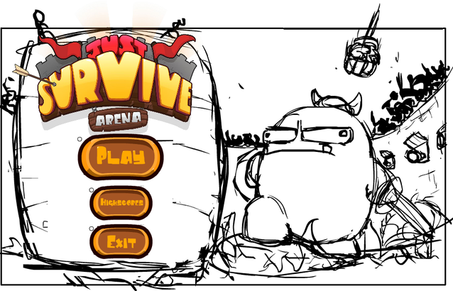 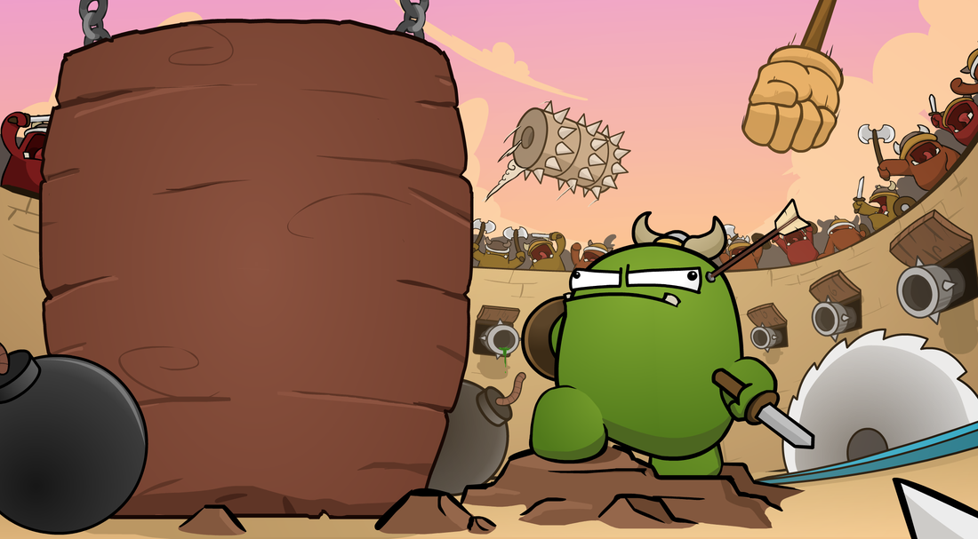 This week was less about quantity and more about quality, so apologies for the lack of content. Hopefully next week I'll have the UI done, the medal changes as I mentioned last week, and some video footage. Oh! I'm also keen to show you an idea I have for the credit screen... Well, when I get around to it that is. So stay tuned for that as well! Until next week, Thanks for reading!
0 Comments
Leave a Reply. |
AuthorLindsay is a solo game developer, designing and creating games that he hopes all will enjoy. Archives
February 2020
Categories |
 RSS Feed
JuicyBeetleGames® 2016. Terms and Conditions apply for all products and Services. Please read them carefully to understand what we cover. To view the Terms and conditions, click here. To view our Privacy Policy and what information we use, please click here.