|
Hey all! Welcome to this weeks long awaited Juicy Dev Blog! For the past few weeks, I've been working hard on implementing the shop system. After tirelessly trying to decide on color schemes, backgrounds, UI designs, placements, where and how I would add the inventory AND the functioning shop assets, I had FINALLY manage to complete it! And, from what I've got, I'm quite happy with the final result if I do say so myself. Without further delay, let's jump into it! The first hurdle I had when deciding on a shop screen was how it should look. I really loved how the PC game 'Cup Head' represented their shop screen, with the old-style shop counter and the shop keeper ever so patiently waiting for you to purchase an item. I really wanted to incorporate that design into my game but with my own flair and style. I also needed to consider what could be purchased, and where it displays. Rather than having an ever scrolling item page, I wanted to incorporate a more practical design. So, I decided to implement 'tabs' instead. This allowed me to keep everything on the one screen and allow the player to see only what they needed to see at specific times. 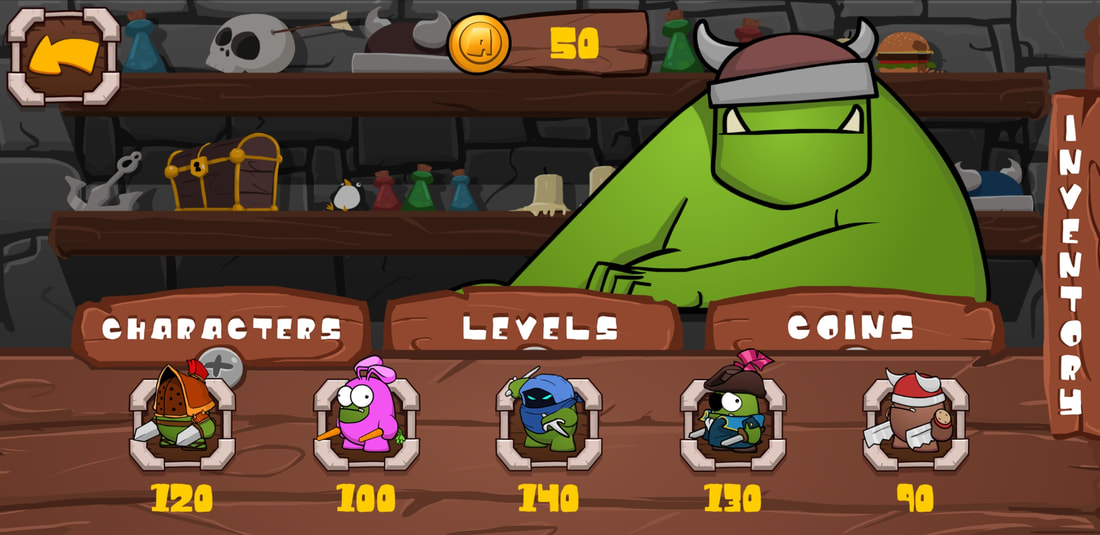 I then came to my second hurdle; The inventory display. Now, a lot of mobile games these days have what the player has purchased as well as what they can buy all on one screen. I was curious to know why, so I delved into it a little more and found out that it's mainly due to the fact that players don't like going from screen to screen just to access simple features (which makes sense). So I decided to also incorporate an inventory section within the shop screen. After a few trial designs, I was beginning to wonder how the player would know if the inventory is on this page at all? I thought a little while on this and came up with a solution. Instead of having it 'tucked' away from sight when the player visits the store, instead, it would be the very first thing the player would see. This would hopefully make it clear that the player can access their inventory here and know exactly where it was. The more I thought of this, the more obvious it was to have something like this. Think about it; The first time the player wants to access their inventory would be the first time they would need to purchase such customizable items. The next hurdle was deciding on a design of the character/level 'selection' icon, to tell the player what they have currently selected. This wasn't as hard, but still quite tedious. Eventually, after a few more design choices, I decided on a simple one, which fits quite well with the theme of the game. 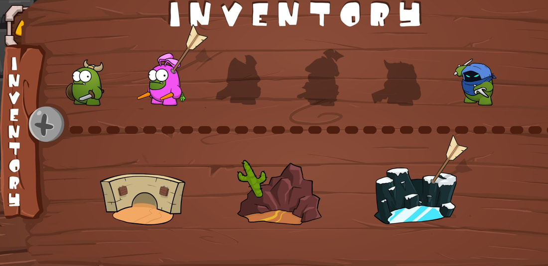 Character inventory slider active. The arrow on the second character and the last level is the character/level 'selector' icon. Once the Inventory slider was functioning correctly, it was now time to implement the functionality of the purchase events, and how to display them. This part was a little easier since I had done this previously with my last game (Slidey Feet). All I needed to really do was the design elements for this purchase system. 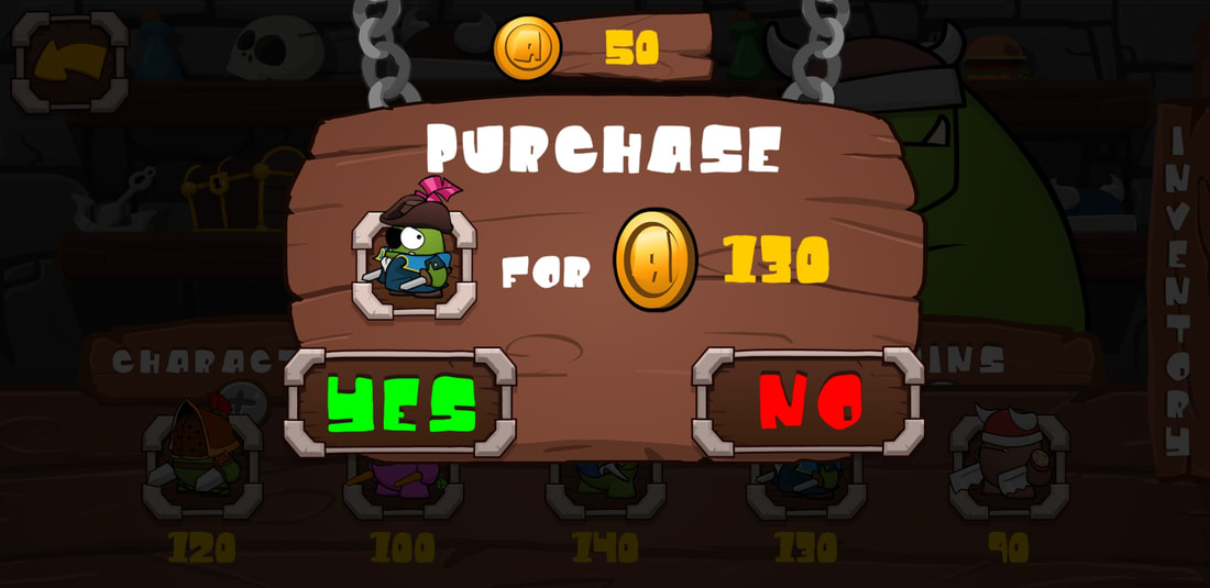 Then finally, I managed to fix all the minor bugs which I found along the way, and ended up with this! Hopefully you like it as much as I do! Again, if you have any suggestions, please let me know! Would love to hear them! Next "week", I'm hoping to really refine the game play to the point where it's deemed playable (to a beta testing standard) so that I can start to organize Beta testers! Yay! If you are interested in beta testing 'Just Survive: Arena', please don't hesitate to contact me either through twitter, instagram, or facebook. Even throw an email my way at [email protected]! That's it for now, Until next time! Thanks for reading
0 Comments
Leave a Reply. |
AuthorLindsay is a solo game developer, designing and creating games that he hopes all will enjoy. Archives
February 2020
Categories |
 RSS Feed
JuicyBeetleGames® 2016. Terms and Conditions apply for all products and Services. Please read them carefully to understand what we cover. To view the Terms and conditions, click here. To view our Privacy Policy and what information we use, please click here.